
Jeanie’s music studio
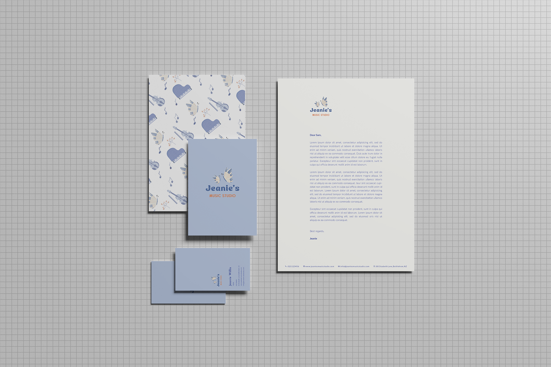
Project scope - Visual Identity

Designing for Jeanie's Music Studio was a balance of harmony and playful energy. I focused on creating a visual identity that not only sparks excitement in young students, but also communicates a sense of nurturing guidance and professionalism to parents. The result is a brand that is both energetic and approachable—a symphony of creativity that celebrates the joy of music for all ages.

Clear Space.
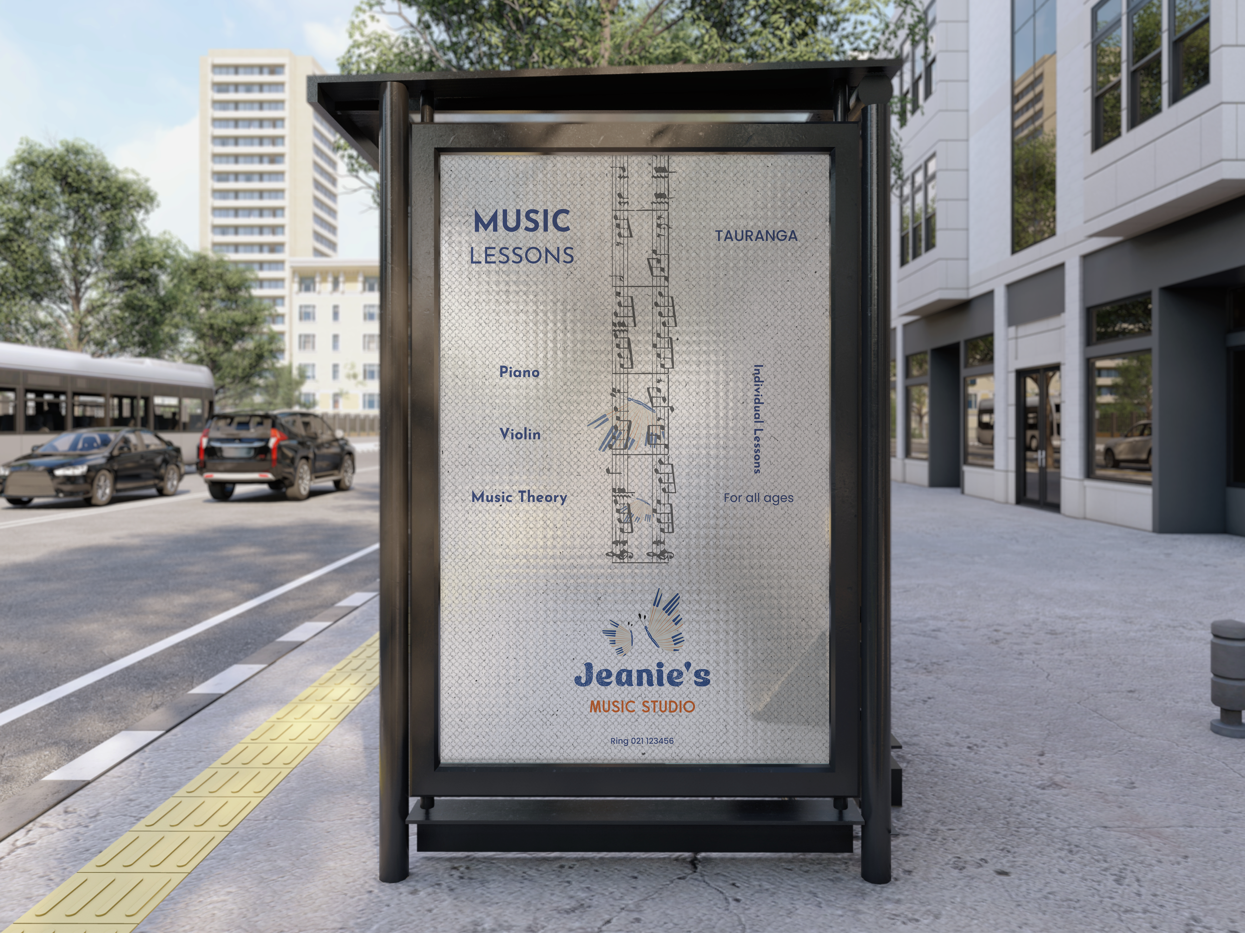
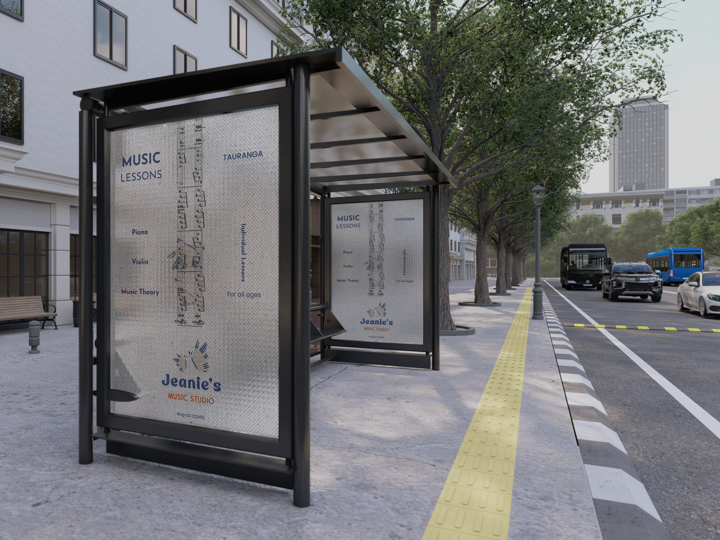
POSTER
Stickers


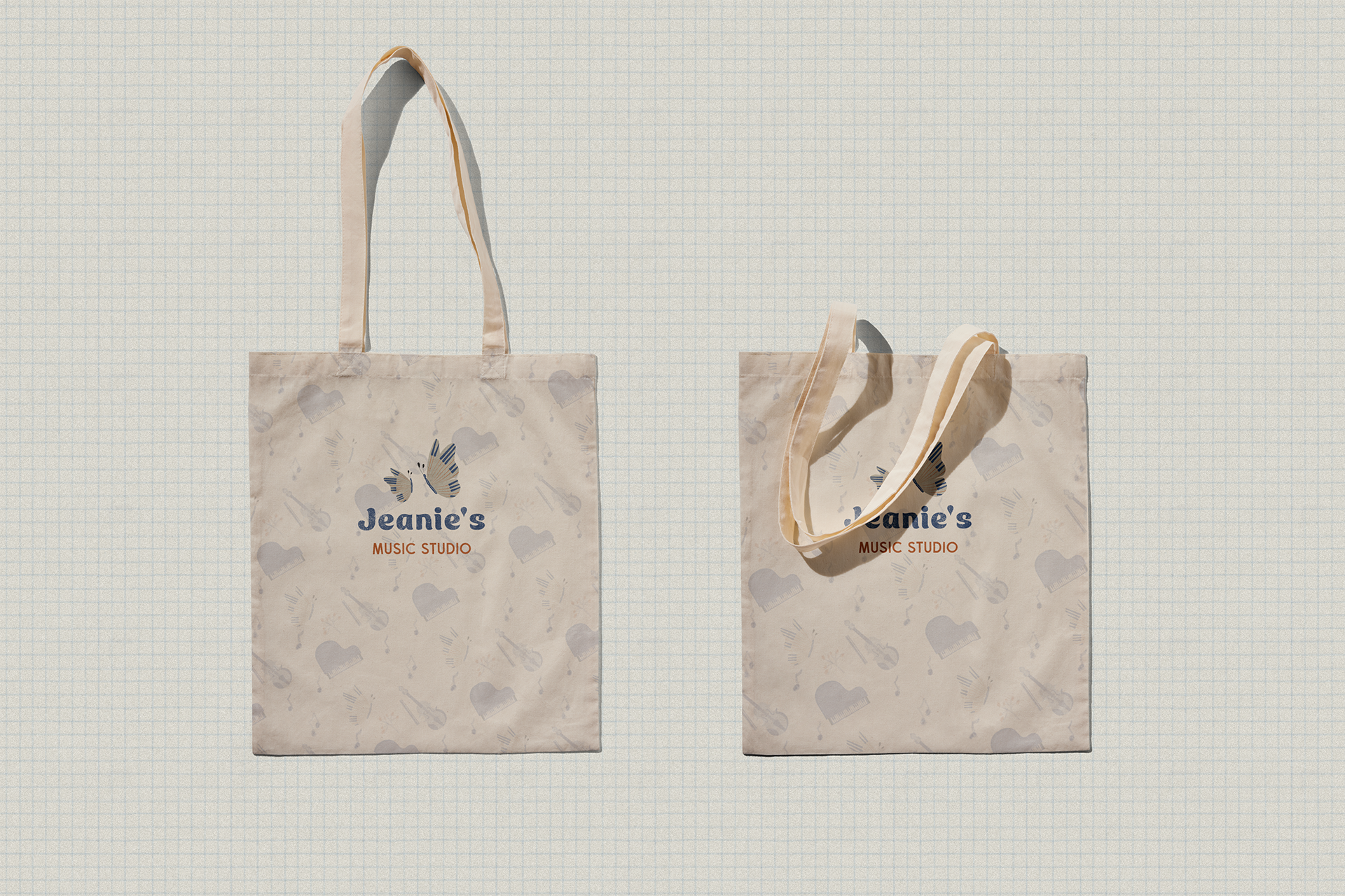
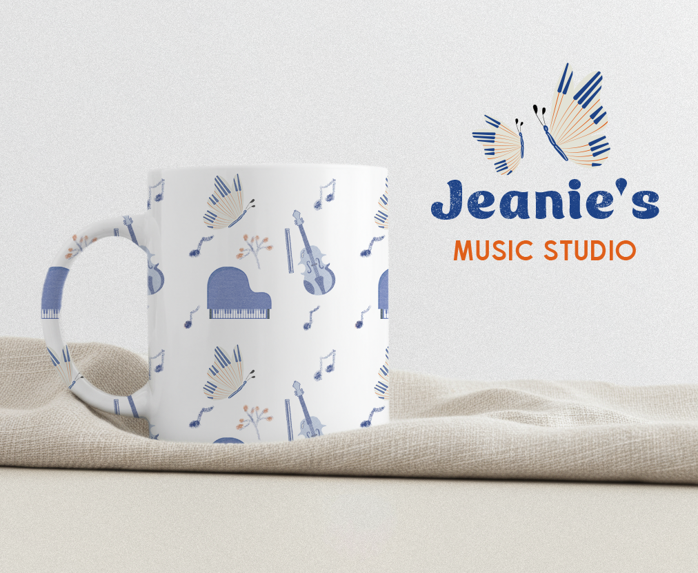
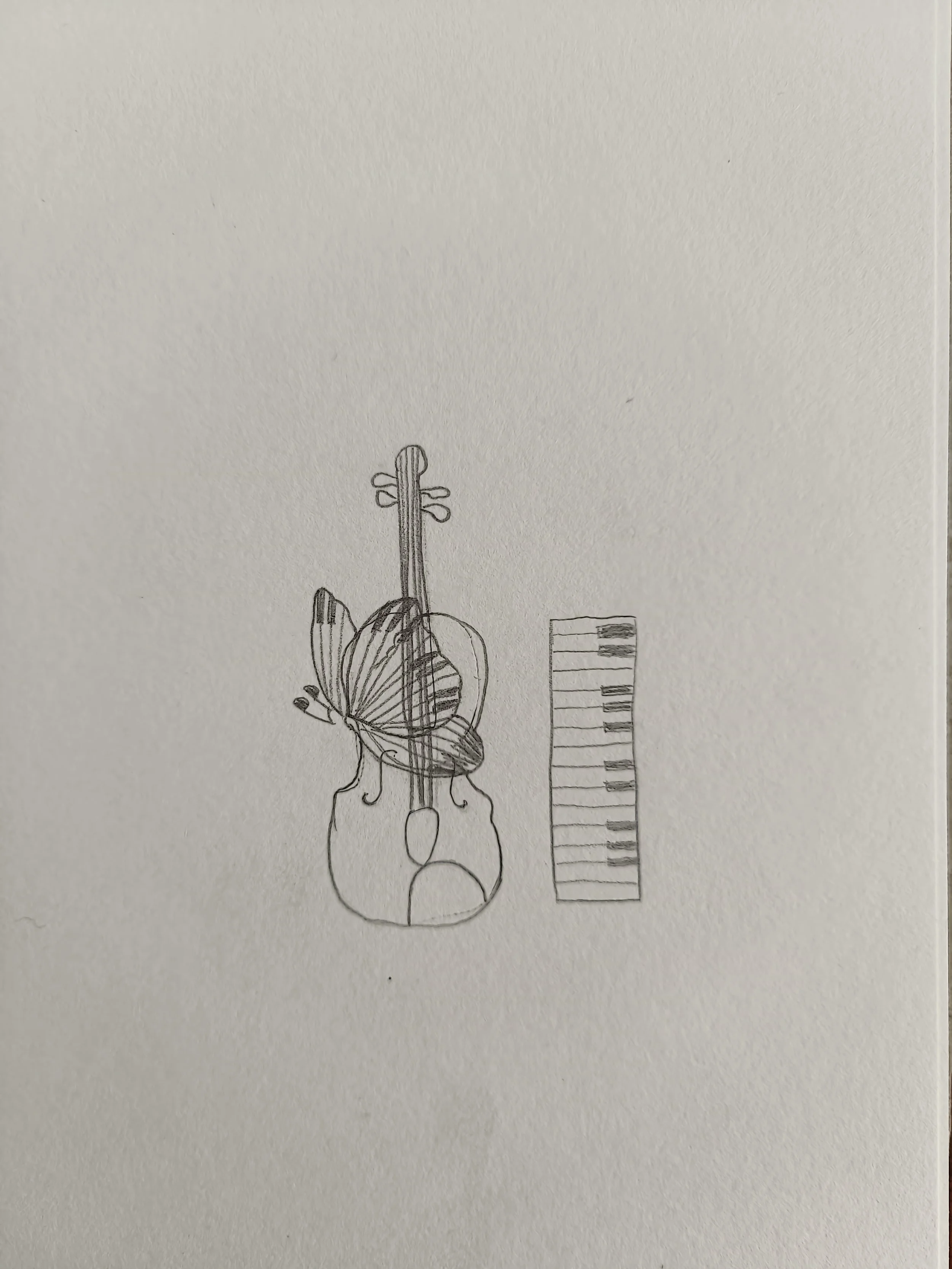
Pattern on merchandise
DESIGN INSIGHTS

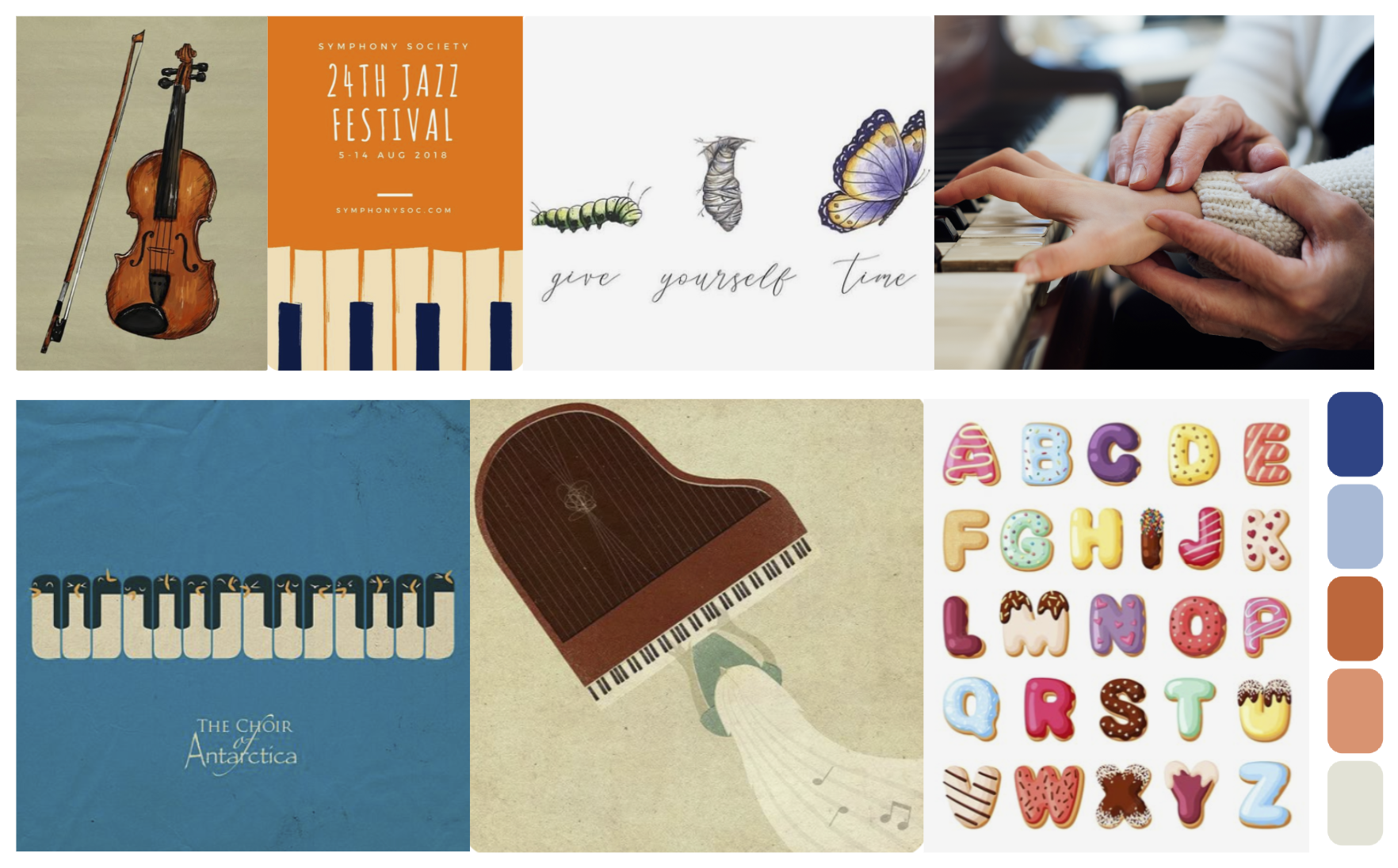
This mood board effectively blends a sense of musical heritage with a playful, modern aesthetic. The colour palette is built around the strategic use of blue and orange, which are complementary colours. The high contrast between them creates a visual dynamic that is both striking and harmonious. Blue presents a calming and trustworthy presence. This is particularly appealing to parents, as it suggests stability, professionalism, and a serious commitment to education. Orange is a colour that symbolises creativity, enthusiasm, and joy, which directly appeals to the vibrant, imaginative world of children learning music. The delightful, sweet typeface creates a welcoming and exciting vibe, making the brand more family-friendly. The butterfly's journey from a caterpillar to its final form is a universal metaphor for growth, development, and transformation. For a music school, this directly symbolises a student's journey from a beginner to a confident musician. It represents the nurturing process and the beautiful outcome of dedicated learning.